
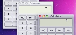
The desktop layout in Mac OS X Yosemite is undeniably beautiful—it's sleek, simple, and easy to admire. Thing is, I do too much on my Mac to install a developer preview as my main OS (even though I can make a bootable install drive and dual-boot it), but I do want the aesthetics of the new build.
Luckily, there is a way for us to mimic the appearance of OS X Yosemite, for free, without installing the developer preview. As long as you have Mac OS X 10.9 Mavericks, you can have the dock and icons that come with Yosemite, all the while sticking with the stability of your current OS.
Download the Essentials
We need to download all the essentials that allow us to modify our Mac icons and dock.
Step 1: Download the Icon Packages
Johan Chalibert has created a beautiful suite of icons that we can download directly from his deviantART page. Download all of the following: Official Icons Pack, Folder Icons, and Trash Icons.
The icon for iTunes is missing in Johan's packs, but you can get that one separately from Ziggy19's deviantART page.
Step 2: Download LiteIcon
Next, we're going to download LiteIcon, a program that'll allow us to change icons—download version 3.2.
Step 3: Download cDock
Now, we need to download cDock, which will allow us to customize our Mac's dock.
Step 4: Unzip All the Downloaded ZIP Files
We need to unzip all the files we just download. To do so, just double-click on each file. You should get one folder (for the deviantART package) and two executable apps (LiteIcon and cDock).
Swap Icons
Now it's time to swap all the icons. Open up LiteIcon and move it to the right of your screen. Then open up the three folders from the icon pack .zips that we just extracted.
Step 5: Applications
Let's start with the icons. Go to Apps in LiteIcon, and begin dragging the new icons over from the "official icon packs" folder to the originals in LiteIcon. If you downloaded the iTunes icon separately, don't forget about that one as well.
Step 6: Dock (Finder/Trash)
Then proceed to do the same with the Trash and Finder icons from the "trash icon" folder.
Step 7: Folders
Finish by replacing the Folders icons using the ones from the "folder icons" folder.
Step 8: Apply Changes
Hit the Apply Changes button at the bottom-right of the LiteIcon's window. It will then tell you it needs to clear cache and log out, so hit "Okay" and go through the login process to log back in.
Customizing the Dock
Now, it's time for us to customize our dock. Open up cDock and let's get started.
Step 9: Select "Install Customizable Dock"
Once the program opens up, you are greeted with multiple options—select Install Customizable dock.
Step 10: Edit TextEdit Values
Two TextEdit values will open up; one is titled Dock Settings, and that's the only one we need to focus on. The original file looks like this by default:
The first four values read out like this:
255
255
255
50
Change that to:
100
100
115
80
When you're done, the file will look like this:
Once you've changed it, save it.
Step 11: Restart Dock
cDock has an icon running in your Mac Bar that looks like a black cube.
Click it, and it will automatically restart the dock with the new settings. The program can be a little glitchy at times, so if you don't see any changes, simply repeat Steps 9 through 11.
New Look, Stable Software
Now we have an updated look with our same, stable operating system, which is just enough to get me by until Yosemite officially releases. What do you guys think?
Just updated your iPhone? You'll find new emoji, enhanced security, podcast transcripts, Apple Cash virtual numbers, and other useful features. There are even new additions hidden within Safari. Find out what's new and changed on your iPhone with the iOS 17.4 update.


3 Comments
Hey! Thanks for the walk through on this. It looks great :) But I was wondering about the dock. I got it to work, but isn't the dock supposed to have rounded edges? I'm just getting a square. See attachment.
I can not agree with you more. Looking at the new flat/er(some are flat and some not so flat) icons they look very toy and in some case's harder to understand: E.G the icon for the games centre on mavericks "some recognisable game pieces like a chess pice and a dart in a target but the new one is just bubbles how you/anyone get's the message that this is the "Games centre" I can not say.
My dock has not the transparent background... why?
Share Your Thoughts